Gene Expression Data Analysis Suite (GEDAS)
Proximity map view
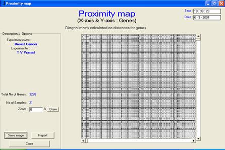
· Description or interpretation: The proximity map visualization is a map of distances plotted genes vs. genes. After clustering or classification, the genes are arranged in a sequential order on cluster number and a diagonal matrix of distances between one another is generated. Therefore, the proximity map or distance map is essentially a symmetric/diagonal map. It helps in giving an idea of cluster distances through visual relief. The more black boxes, larger are the distance between clusters. This map representation is similar to the distances table of various cities in the world as seen in the diaries. The entire gene expression matrix is sorted on the cluster number column (an extra column added after clustering), and then the distance matrix is developed. Distance matrix is a diagonal matrix, which is later replicated on the other axis for convenience. Once the distances are computed, each value is displayed in the form of a coloured box. While the white colour represents zero distance, black represents maximum distance. The diagonal line is always white in colour and indicates that the distance between the same genes is always zero. The advantage of this representation is that with just a small plot, a fair view of cluster distance can be determined, Figures 1 and 2.
· Complexity: The proximity map has a computing complexity of O(n2). The biggest drawback is that it requires sorting of the entire gene expression data matrix.
· Special considerations/features: The black and white proximity map is being given a coloured effect by displaying all the bands of genes within a cluster in a single colour shade. With different colours assigned for each cluster, identification/ analysis of cluster distances would be much easy.
· Advantages and drawbacks: This representation can be extended to provide better graphical user interface so that a desired rectangular portion can be selected and corresponding genes can be mined out from the database. Till recently, it has been applied sparsely, but through the GEDAS, it has been attempted to show that the proximity map could be one of the most powerful visualization techniques at par with the dendrogram output in analysis of gene expression data.
·
Applicability: Through GEDAS, this has been applied to SOM, LVQ, k-means, HC, SVM and PCA.
|
|
|
|
|
|
|
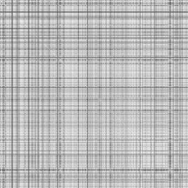
Figure 1: The proximity map visualization
is a map of distances plotted genes vs. genes. Usually, it is
symmetric/diagonal map. It has been applied to raw, preprocessed and
clustered data |
|
|
|
|
|
|
|
|
|
|
|
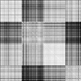
Figure 2: The proximity map visualization is a map of distances plotted genes vs. genes. Usually, it is symmetric/diagonal map. Proximity maps of raw data set and clustered data can be seen here |
|