Gene Expression Data Analysis Suite (GEDAS)
Wave/Temporal graph view
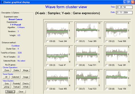
· Description or interpretation: The cluster view representation is a primitive visualization for gene expression data widely used by many scientists. The clustered data is visualized in the form of a set of waves, in which each wave corresponds to a gene across samples on the X-axis. This graph is also known as the temporal or wave graph view, Figure 1. This graphical visualization technique could be extended to provide pie graph so that it can represent the number of genes expressing high or low, or any other parameter required within the same cluster.
· Complexity: This technique is a linear representation using the additional column appended to the expression data matrix for cluster number, hence, working at O(n2).
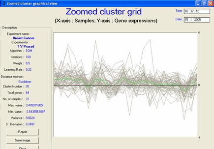
· Special considerations/features: An extra wave is plotted in black colour to indicate the average value of each sample in the cluster, which gives a fair idea of the expression level. It is also essential to display the zoomed view of each cluster or temporal graph to enable researchers to see the expression behaviour in enlarged form, as shown in Figure 2.
· Advantages and drawbacks: The combined plot of all the waves as shown in Figure 1 can be used to determine the level of expression, overall as well as for specific samples. This visualization is very helpful for representing time series data. Though, it is visually very attractive as compared to the textual counterpart, it requires a further GUI support to extract the corresponding gene names. When the number of clusters desired is too many, there can be many similarly expressing clusters, which require to be merged into one another. For a dataset containing discrete data (such as those containing numerous parametric values), this representation could render no meaningful use.
· Applicability: It can be applied to all clustering/classification techniques including SOM, LVQ, k-means and SVM. Through GEDAS, this has been extended to HC and PCA.
· References: GEPAS web site of CNIO, Expression Profiler, GEDAS software
|
|
|
|
|
Figure 1: The temporal/wave graph
view. Each cluster contains a number of genes represented as a wave,
the green line is the average expression level |
|
|
|
|
|
Figure 2: The
zoomed temporal graph view gives the visualization of each cluster’s
behavioural pattern |