Gene Expression Data Analysis Suite (GEDAS)
Data Visualization Techniques
A study of all available visualization techniques and their importance in analysis of gene expression data was carried out. Different algorithms used different visualization techniques for analysis of the data. Some of the classical references are Eisen et al (1998), Tavazoie et al (1999), Toronen et al (1999), Kohonen et al (1996), GEDA, de Hoon et al (2004), Caron et al (2001), Chen (2004), Dopazo (1999), Luo et al (2003), SNOMAD of Colantuoni et al (2000), Ewing and Cherry (2001), Kapushesky et al (2004), Cleaver 1.0 of Stanford Biomedical Informatics (2004), etc.
Earlier, there were cases when the same visualization technique was used differently, such as the SOM output as seen in the difference in implementation of the GEPAS server, and the initial SOM version developed Kohonen et al. While the former brought out clear and unique clusters as hexagonal grid, the latter produced many null clusters as well as similarly behaving clusters, which required altogether different visualization containing special colour coding and mapping scheme to generate heat map for proper identification. This helped in identification of similar clusters.
Kaski
(1997) used SOM on various kinds of datasets, also emphasized on visualization
through SOM and brought a comparison of k-means and SOM. Use of
non-linear projection methods such as MDS, Sammon’s mapping, principal curves
(which are generalization of principal components), triangulation method and
replicator neural network were also discussed in the work.
Figure 1: Profile plots
|
|
|
|
|
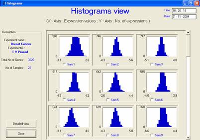
(a) One histogram for each sample
– plots indicate that all samples follow normal distribution |
|
|
|
|
|
|
|
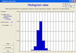
(b) The overall
frequency vs. gene expression plot of the entire dataset matrix should also
produce normal distribution |
The GEDAS software provided a platform for holding together all these visualization techniques for analysis of preprocessed data and processed data clusters through the use of group plots and individual plots. Facility has been provided to easily switch from one output form to another by selecting the corresponding button. Flexibility to save the images of visualization was provided so that they could be incorporated into the reports. The software can store the output results either individually according to each visualization technique or as an integrated report. All outputs can be viewed either on the screen or saved in Acrobat PDF format for future use. For instance, histograms of all samples can be viewed in the GEDAS software so as to ensure that they follow the normal distribution, as shown in the profile plots in Figure 1.
|
|
BRCA1 vs.
BRCA2 |
BRCA1 vs.
Sporadic |
BRCA2 vs. Sporadic |
|
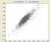
Mean (Group1) vs. Mean (Group2) |
|
|
|
|
|
|
|
|
|
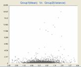
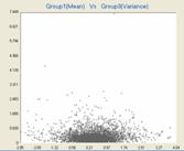
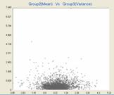
Mean (Group1) vs. Variance (Group2) |
|
|
|
|
|
|
|
|
|
Variance (Group1) vs. Variance (Group2) |
|
|
|
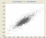
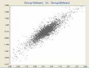
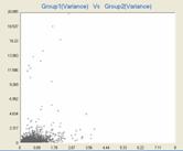
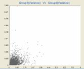
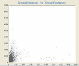
Figure 2: Group plots provides flexibility to view the differential gene expression in the data by means of plots such as mean vs. mean, mean vs. variance and variance vs. variance of two or more groups.
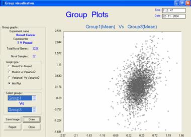
It was observed that while one software suite presented well in terms of statistical computation, the other presented it in the form of equivalent graphs, and still further another suite presented the output in altogether different graphical form. Graphs such as group plots, MA plots, etc. that have great significance in biological data mining have been successfully incorporated in the GEDAS software, Figures 2 and 3.
The visualization techniques provided through this work have been elaborately described in subsequent sections below, over standardized parameters like description, visual output example, complexity, special features, advantages and demerits, applicability, references, etc. There also exist a number of other visualization techniques that have not been incorporated in this work.
|
|
|
|
|
Figure 3: The MA
group plot provides view of the amount of spread in the overall gene
expression pattern in the data groups. These plots could be obtained
for data before transformation and cannot be obtained for negative or zero
data. |
Features table
A consolidation of the views that can be provided
for visualization vs. algorithms has been listed in the following table, click
on the visualization technique to view the detailed description:
|
Visualization/Algorithm |
Raw data |
Pre-processed data |
SOM |
K-Means |
LVQ |
HC |
PCA (gene) |
SVM |
|
√ |
√ |
|
|
|
|
√ |
|
|
|
√ |
√ |
√ |
√ |
√ |
√ |
√ |
√ |
|
|
√ |
√ |
√ |
√ |
√ |
√ |
√ |
√ |
|
|
√ |
√ |
√ |
√ |
√ |
√ |
√ |
√ |
|
|
√ |
√ |
√ |
√ |
√ |
√ |
√ |
√ |
|
|
Temporal (incl. zoomed cluster view) |
|
|
√ |
√ |
√ |
√ |
√ |
√ |
|
|
|
√ |
√ |
√ |
√ |
√ |
√ |
|
|
|
|
|
|
|
|
√ |
|
|
|
|
|
|
|
|
|
√ |
|
|
|
|
|
|
|
|
√ |
|
|
|
|
Scatter plot |
|
|
|
|
|
|
√ |
|
|
Decision (or search) space |
|
|
|
|
√ |
|
|
√ |
|
√ |
√ |
|
|
|
|
|
|
|
|
|
|
√ |
√ |
√ |
√ |
√ |
√ |
Look for improved tree view visualization here.
